At aleena's® Studio, we believe that design is more than just aesthetics—it’s about communication. Color is the first thing a user notices about your brand, and it triggers an emotional response long before they read a single word of your copy.
"Research shows that up to 90% of snap judgments made about products can be based on color alone. It’s the visual shorthand for your brand’s personality."
How Colors Drive Emotion
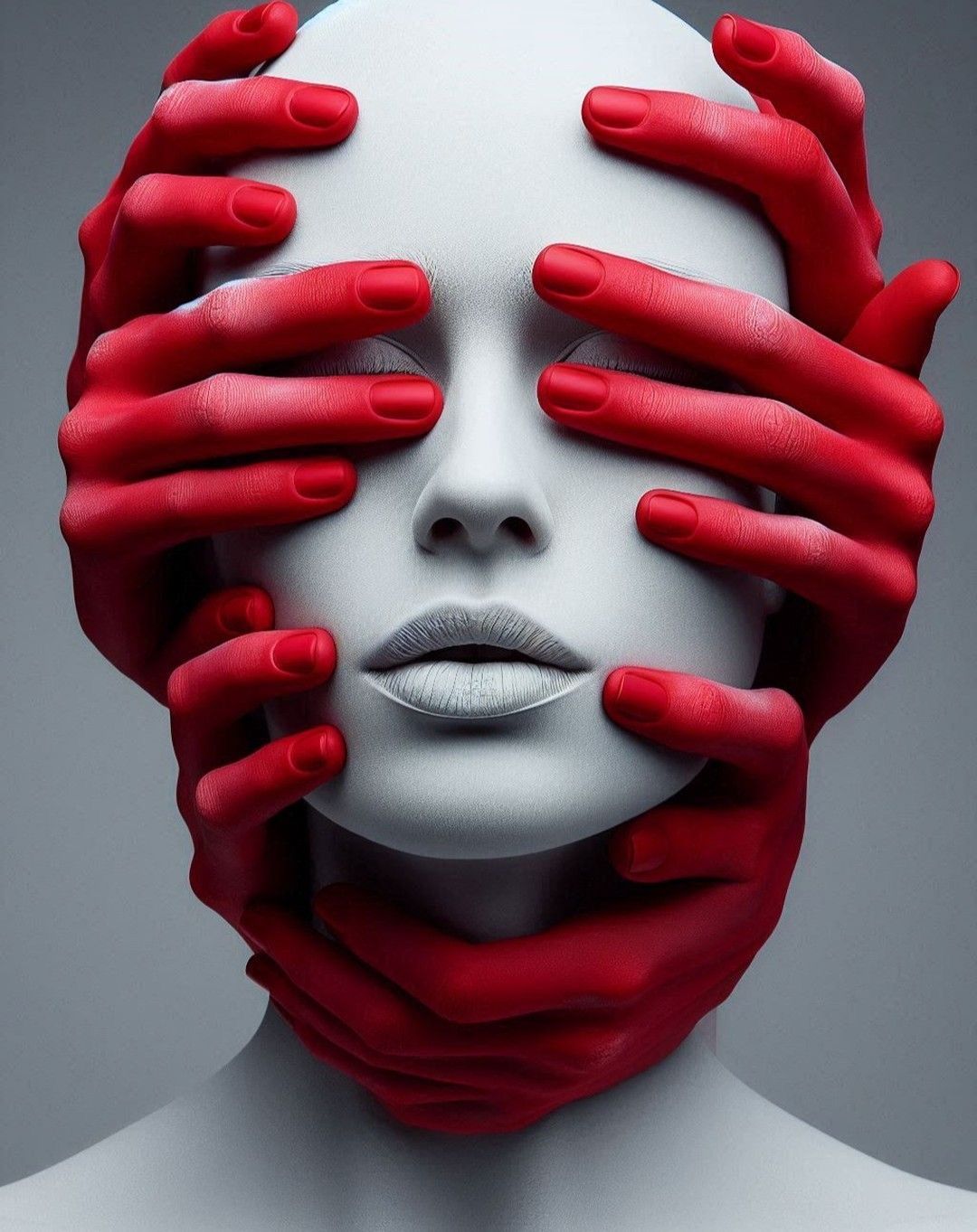
Every hue carries a specific psychological weight. Blue is often associated with trust, stability, and professionalism—which is why it dominates the tech and finance industries. In contrast, Red evokes urgency, passion, and energy, making it ideal for retail sales or food brands that want to stimulate appetite and action.
Strategic Palette Selection
Building a brand palette requires more than just picking your favorite colors. You must consider your industry and target audience:
- Monochromatic: Creates a clean, high-end, and minimalist look.
- Complementary: High contrast colors that make elements "pop" (great for CTAs).
- Analogous: Colors next to each other on the wheel, creating a serene, unified feeling.
- Cultural Context: Remembering that color meanings can change drastically across different global markets.
Accessibility and Contrast
A beautiful palette is useless if it’s unreadable. In digital design, we prioritize "Color Contrast Ratios" to ensure that users with visual impairments can navigate your site effectively. We use color to create a hierarchy, guiding the eye to the most important information first.
The Business Impact
Consistency is key. Using a signature color can increase brand recognition by 80%. When a user sees your specific shade of green or orange across social media, your website, and your packaging, it builds a sense of familiarity and trust. If your brand doesn't have a defined color strategy, you're leaving your first impression to chance.