At aleena's® Studio, we’ve seen typography transition from a static design element into a dynamic tool for storytelling. In an era where attention is the ultimate currency, the way words look is becoming just as vital as what they say. We are entering an age of "fluid" type that breathes with the user.
"Modern typography is no longer bound by fixed weights and styles—it is a living system that adapts to the screen, the setting, and the soul of the brand."
The Rise of Variable Fonts
The biggest shift in web typography is the widespread adoption of variable fonts. Unlike traditional font files where each weight (bold, light, italic) requires a separate download, variable fonts contain an entire typeface family in a single, lightweight file. This allows for infinite micro-adjustments in weight, width, and slant, optimizing performance without sacrificing creative freedom.
Key Trends Shaping the Screen
As we design for high-resolution displays and immersive environments, several key movements are taking center stage:
- Kinetic Typography: Type that moves or reacts to scroll triggers, turning a simple headline into a cinematic experience.
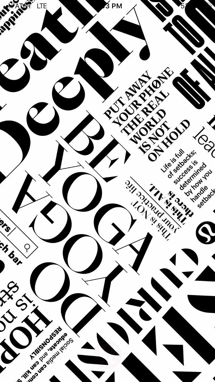
- Maximalist Expressive Type: Breaking the "minimalist" grid with oversized, distorted, or hand-drawn characters that command attention.
- Accessibility & Customization: Interfaces that allow users to adjust font size and line height dynamically to suit their visual needs.
- AI-Generated Typefaces: Using machine learning to create unique, brand-specific letterforms that evolve based on user interaction.
Type as Interface
We are seeing a move away from heavy imagery toward "Type-First" design. In this approach, typography becomes the primary visual hook. By utilizing high-contrast pairings—such as a brutalist serif against a sleek, tech-focused sans-serif—brands can establish a premium feel while ensuring that their core message remains the hero of the page.
The Future: Context-Aware Type
The next frontier is typography that senses its environment. Imagine a website where the font weight increases automatically in bright sunlight to improve legibility, or narrows slightly on smaller mobile devices to prevent awkward line breaks. At aleena's® Studio, we believe the future of the web isn't just readable; it's responsive in every sense of the word.

